Design 6, spring '21
Industry project, working with SFI autoship to design an interface for an operator of autonomous passenger ferries
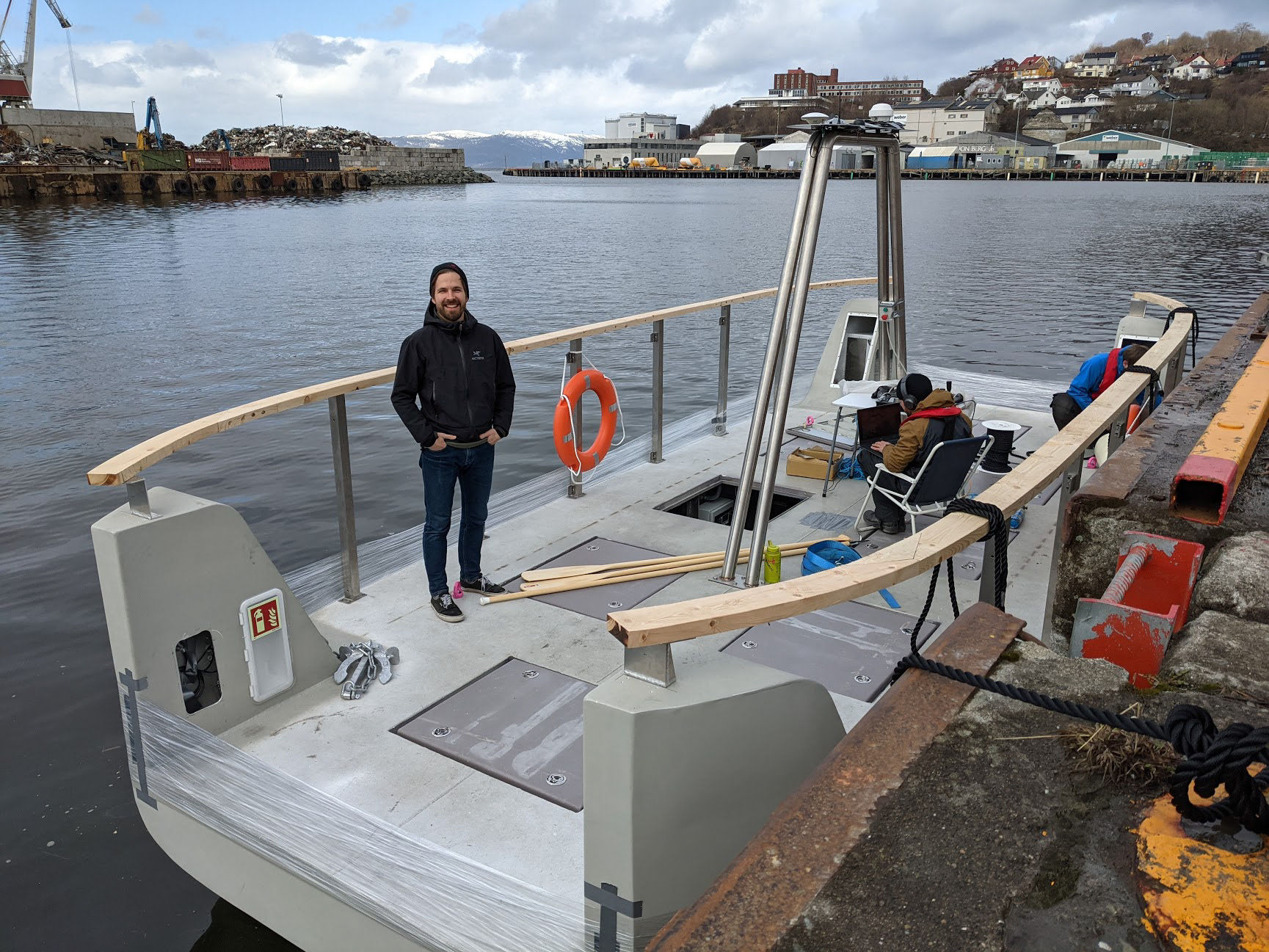
Design 6 was a large, semester long project together with a real company, where we were to work on a real case. I chose the autoship project, because at the time I was interested in exploring UI design. The project was to design an interface for an operator of an autonomous ferry. Due to the self-driving nature of the boat, the main tasks of the operator are to monitor the ferry, as well as it's passengers, and be ready to take manual control of the ferry if something goes wrong.
The beginning of the project was largely research and dialogue with my client, to gain some understanding and insight into how the ferry operates, where it operates, what could possibly go wrong, how many operators, how many ferries per operator, and a slew of other questions. Since this was such a large project, I wanted to make sure that I designed something that would actually be useful, and solves the case in the best way possible.
One of the core requirements in the project was to draw inspiration from video games for the design of the individual operator screen. Discussing with the client, the reasoning was to be able to maximize the size of the camera feed. To accomplish this, I did research on how opacity and small UI elements are used as overlays in games, before implementing my solution.
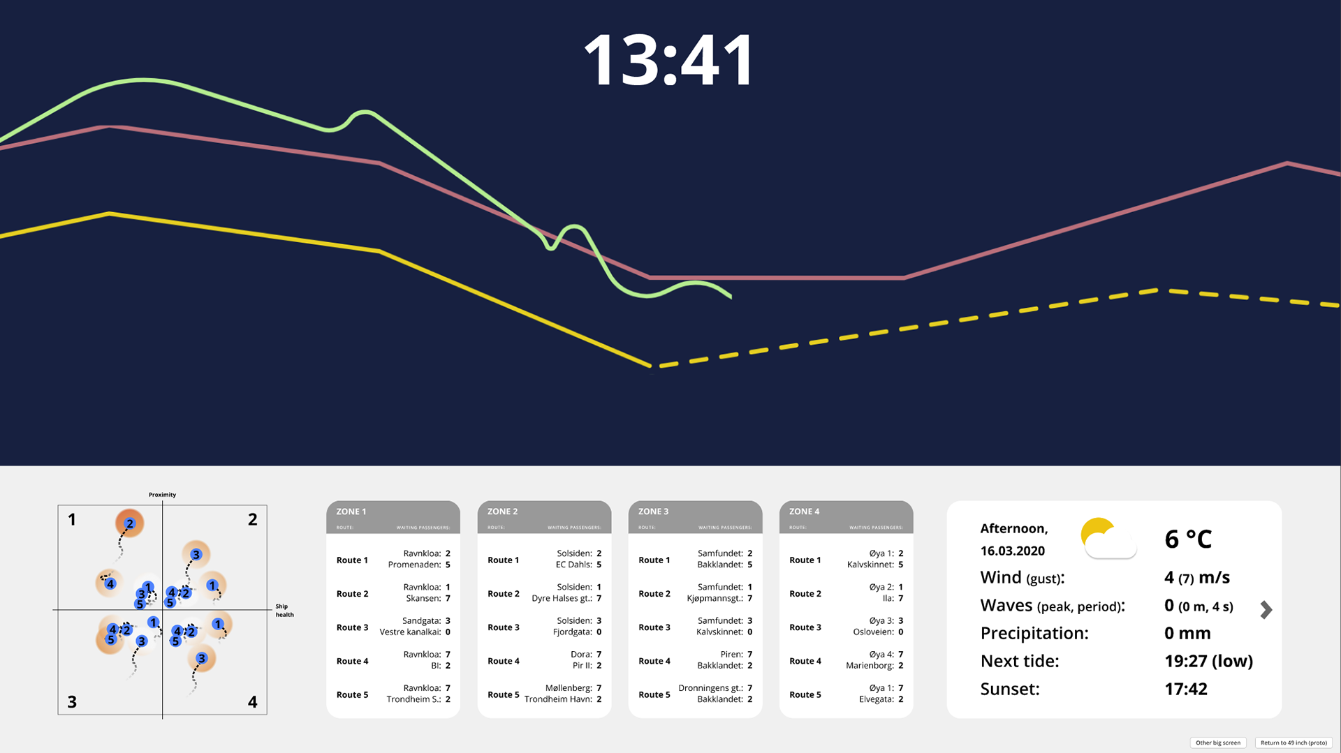
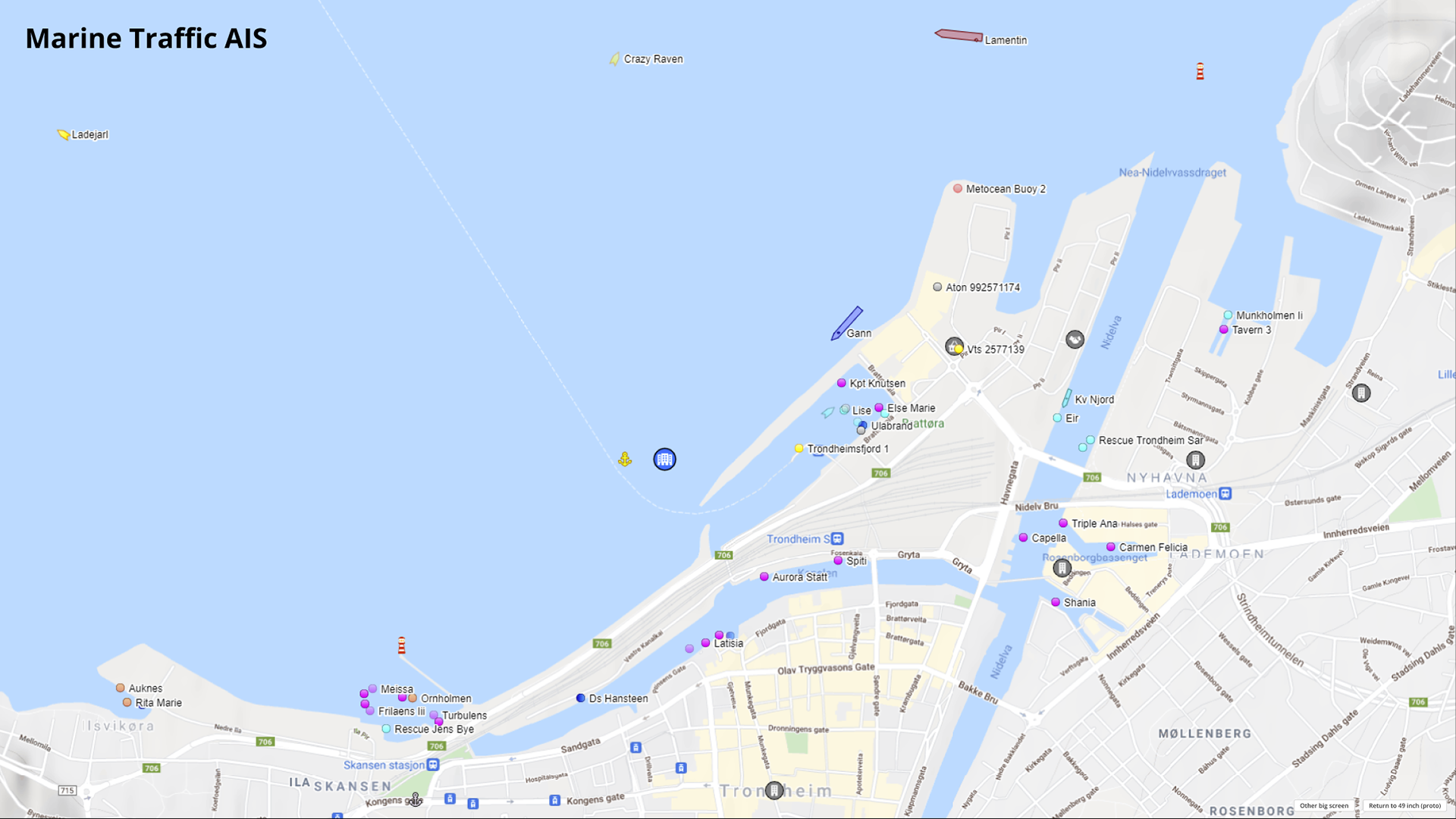
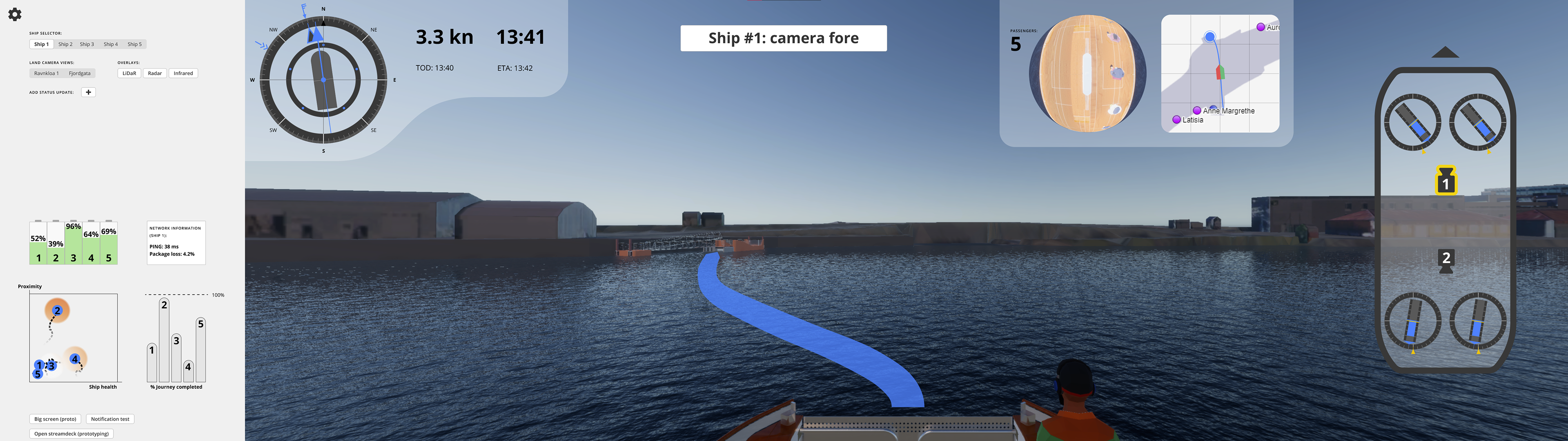
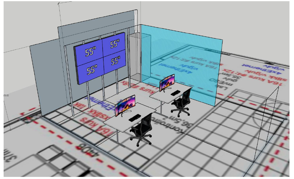
Since I was designing a digital UI, I spent most of my time in Figma, switching over to digital or whiteboard sketches when in dialogue with non-designers. The end result was a combination of 3 screens, where the ultra-wide screen is for each individual operator, while the two larger screens are meant to be general information for all operators.
The reason I split it up was to future-proof my design, so that if the project becomes a success and the number of ferries grows past the capacity of one operator, the whole UI doesn't need to be redesigned from scratch. The main deliverable in the project was the Figma file, which was fully connected so that the UI could be effectively demonstrated and tested.
There is a lot of testing, research and iterative designing that I chose not to document here, as the change over time is not drastic. There are also a lot of small features implemented that I think pull together the whole UI by covering many cases. If you want to take a look at the full prototype, you can find it here.
(Note: The prototype is designed for a 49-inch and two 75-inch screens, so when scaled down some elements could be difficult to see / read.)